Pictures: One at a Time, Full Screen
Episode #4 of the course Presentations: Making slides that work by Barry Brophy
This lesson explains the importance of showing images one at a time and full-screen, if possible.
One Thing at a Time
Even if you have a complex diagram, you can build it up in steps, aided by the animations in PowerPoint.
To explain this further, let’s look at an example of what presenters tend to do:

This is not an extreme example; it is typical. The slide came from a series of presentations at a conference I attended. Obviously (although it wasn’t obvious to the presenter), there is too much content on this one slide: 67 words, 18 numbers, and eight images, giving a total of 93 items. Each item represents a visual instruction—“look at me”—so the viewer is receiving 93 visual instructions simultaneously.
In fact, there are more than 93 pieces of content on this slide because when people see items in a table or grouped in different boxes, they start to make comparisons and look for trends. This is really what visual groupings of this sort are supposed to prompt people to do; otherwise, why group them at all? So, there are probably over a hundred visual instructions on this single slide.
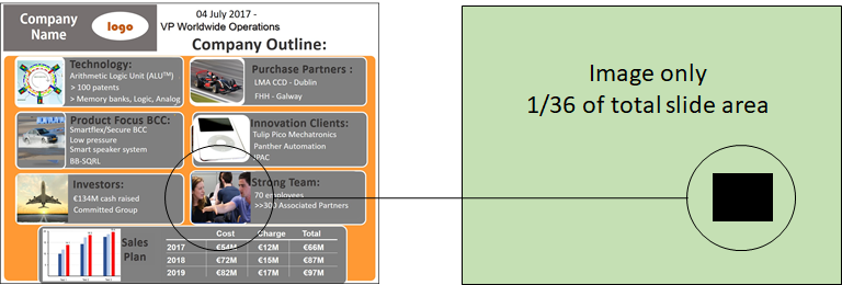
Information overload, though, is not the only problem here. If we highlight one of the images (below) and make a calculation of its area, it can be seen to occupy just 1/36th (or 3%) of the total area of the slide. So, it is effectively 36 times smaller than it could be.

This has two implications. First, it is much harder to see than it needs to be, obviously. Second, it is nestled among many other elements, so it is impossible for the viewer to know in what sequence to view it. By having just one item per slide, you are imposing a visual logic that really clarifies what you are saying. In a fleeting presentation, clarity of this sort is vital.
If you really need to have multiple elements on a slide—a diagram or flowchart, for example—you can use simple animations to make things appear, grow, grey out, or disappear in sync with your verbal delivery. Used with restraint and only to serve your message—no stupid round-of-applause sound effects or bouncing word-swirls—these animations allow you to create clear, powerful visual arguments.
Fill the Screen
This follows on from the last point—“one thing at a time”—but goes a little further. Companies often insist on their employees using in-house templates when making a presentation. These have pre-defined spaces for bullet points and perhaps a box for inserting an image or a graph. They also have a company logo, contact details, and possibly some background design or watermark to reinforce the brand. They don’t look too bad, generally, but when projected onto a large screen, they kill the energy of the central image by telescoping it and surrounding it with scrappy decorations.

The side-by-side slides above demonstrate this point but don’t do it full justice; for that, you would need to see them projected onto a large screen. Viewed like this, a high-resolution image can look truly cinematic. The surrounding information is just fussiness on the part of the presenter, and as a colleague of mine always says, “Having a company template on every slide is like handing the audience your business card and introducing yourself every two minutes.” It’s unnecessary; don’t do it.
The benefit of engaging, full-screen visuals is felt not just by the audience, but by the presenter. They free you to communicate outward instead of gawping at your own slides. They become visual punctuation marks emphasizing your message, not essays you have to read through. Used this way, the presenter and slides together can form a potent, layered audio-visual experience.
Tomorrow, we will look at how the brain processes visual information and how you can use these insights to make your visual aids clearer and more intuitive.
Recommended reading
Eleven Dos and Don’ts of Using Images in Presentations
Recommended book
Share with friends

