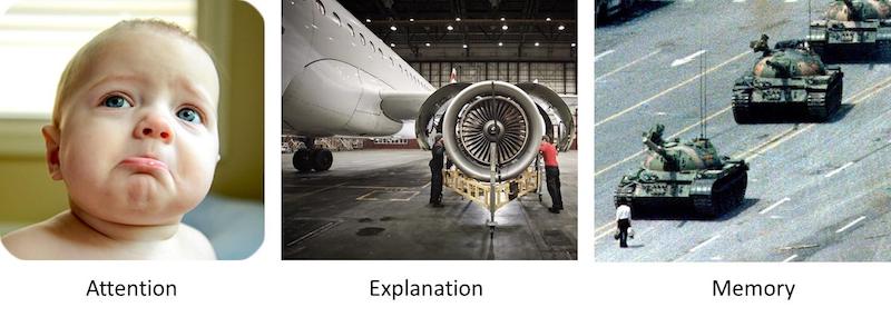
Pictures: Attention, Explanation, Memory
Episode #3 of the course Presentations: Making slides that work by Barry Brophy
This lesson explains how images work on three timescales.
First (seconds), they grab attention. Second (minutes), they help in the explanation of concepts. Third (months, years, decades), they can stay in memory long after the presentation. The triptych below shows examples of images that could work over these three time frames.

The power of images was really brought home to me by a set of statistics presentations I attended recently. They were a little dull until, halfway through, a woman plugged in her laptop and a splash of color filled the screen, which prompted someone in the audience to involuntarily exclaim: “Wow!”
I thought this might be some sort of computer visualization of a data set, but it wasn’t; it was just her screensaver. A few seconds later, the image was replaced with a dull PowerPoint slide and the presentation proper began.
This story may not seem like much but it stayed with me. First, the biggest reaction of the day was for a screensaver. That tells you something about the dullness of the slideshows you normally see. Second, it made me realize that you cannot tell your eyes what to like. They will be drawn to something before you are consciously aware of what they are being drawn to. Why work against this instinct? Your slides should be relevant to your topic, always, but they can be visually compelling as well.
Images Are Not Decorations, They Do Work
Some people say that a serious, technical presentation is no place for gimmicky images, that you are there to inform, not entertain. But there is nothing gimmicky about the use of appropriate images. Even the most erudite broadsheet newspapers have 30-40% visual content, primarily images.
In newspapers, you also see visuals working on the same three timescales I mentioned earlier: grabbing the attention of the browsing reader (seconds), helping explain and illustrate each story (minutes), and lodging in memory afterward (days, months, years).

The same is true in a presentation. You are trying to grab “attention” at the start and keep grabbing it throughout, so images that engage in seconds are important at all points. You are also trying to “explain” concepts as you go along; images that do this work, over minutes, are also necessary. Finally, you want your presentation to be “memorable” afterward, so you should keep this in mind particularly with the last picture you show, as this image will remain on screen for some time after the presentation concludes.
It is so straightforward, nowadays, to put pictures into a presentation. You can either take these yourself with a phone or search for them online. They should always be relevant to your talk, but you can always bring a visual angle to the concepts you’re explaining. Even if the audience has seen what you are describing before, there is great merit in showing a clear image as a focal point for the ideas you are explaining. People will regard that image with new eyes when you tell them something new about it.
I remember a vivid example of this in a presentation on the declining population of the honey bee. There were full-screen, high-resolution images of bees gathering nectar from brightly colored flowers and one picture that simply showed a pot of golden honey.

The presenter even had a jar of honey on the table. Everyone in that audience had probably seen honey before and tasted it, but they were learning new insights on this topic, and that made the familiar suddenly seem spellbinding. People were looking at these everyday items in a new way. This brought home to me how simple images can be so powerful and certainly much better than a wall of text.
Tomorrow, we will look at some practical tips on how to use images within your presentations.
Recommended video
7 Photojournalism Tips by Reuters Photographer Damir Sagolj
Recommended book
Resonate: Present Visual Stories that Transform Audiences by Nancy Duarte
Share with friends

