
Graphs: Why They Go Wrong
Episode #9 of the course Presentations: Making slides that work by Barry Brophy
Despite what I said yesterday about the power of graphs in turning numbers into shapes, they are often the most confusing part of a presentation. In this lesson, I will look at three main reasons why.
Treating Graphs Like Photographs
The expression “as the graph clearly shows” is rarely true, but in it lies the clue to where presenters go wrong. The speaker sees the graph as they would see a photograph. Photographs and graphs are both visual forms, but a photograph is a direct copy of the physical world, an imprint of light on film, whereas the appearance of a graph depends on many factors that can drastically change its meaning to the audience.
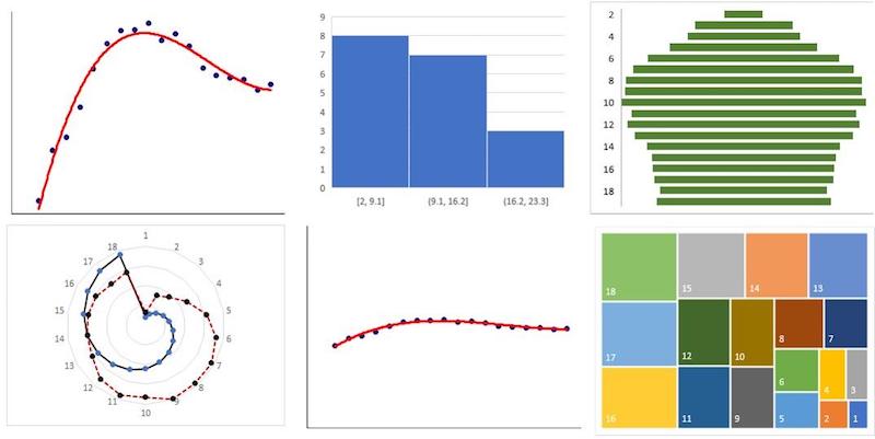
The above figure shows six graphs that were all plotted from the same data set and yet present totally different visions to the viewer. Presenters work from the inside out: They know the point they are trying to communicate, and select and format a graph to make this point. The audience, however, is working from the outside in, from the image they see to the insight they are supposed to conclude. Hence, if the visuals vary wildly, so can the conclusions drawn. Presenters think that everyone sees the same thing they see, as if they are viewing a picture, but with a graph, it’s never that obvious.
So, you should always talk the audience through your graphs as if explaining the rules of a game. “What I’m showing here is …” As we saw in the last lesson, PowerPoint animations can help you to do this in slow, clear steps.
Not Highlighting the Conclusion
Even when you have a well-understood template—graph type, scales, zero-offsets, interpolation of data—what you want the audience to take from the graph and what the audience actually takes may not be the same.
For example, I have taken the data set from the example above and plotted it again, this time identically in each of four cases (see below). However, the conclusion drawn can be different each time.
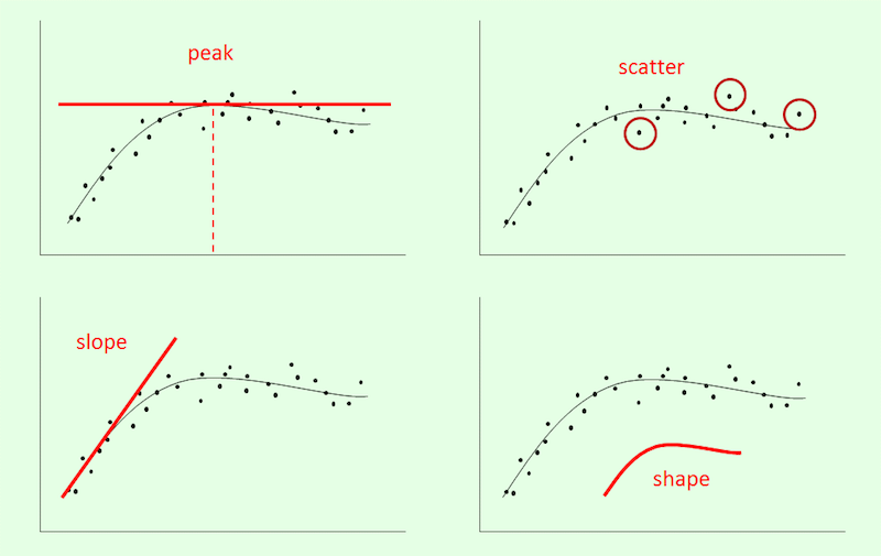
If these graphs were of, say, weekly sales over a six-month period, you might be interested, from a stock management or staffing point of view, in the variation or scatter of data (top right). Or, you may be interested in peak sales (top left), or in the rise in sales (slope of graph) during a particular period and how it coincided with an ad campaign. In other words, it is not enough to just explain how the graph works, you also need to explain what conclusion you wish the audience to draw from it.
Laziness
I could make this point about so many things relating to presentations, but it is particularly true of graphs. People will spend weeks writing a document—a business plan, a funding proposal, a prospectus—but when it comes to a presentation, they will say things like, “I fly in the night before the conference, so I’ll have time to pull some slides together in the hotel.” What will that give you? Bullet points, which are really just notes to self.
A good graph, like any good presentation content, takes time to produce. It takes time to think of the audience’s needs, time to generate ideas, and time to format the graph to your exact requirements.
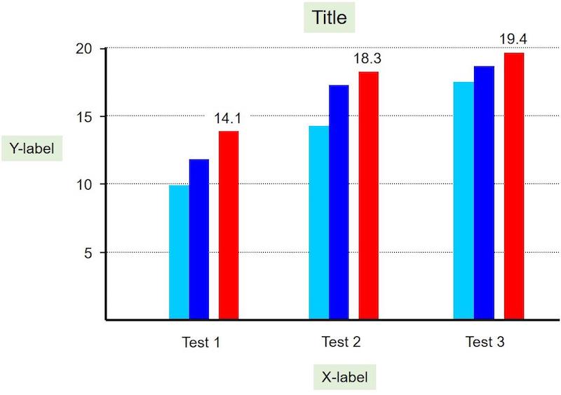
I showed the above graph yesterday, and getting it to look as it does above took me quite a long time. However, when you are clear about what you want to communicate, although it may increase the time to draw and reformat a graph, it reduces your workload in that you only present the important graphs. Bad presenters show plot after plot indiscriminately, whereas good communicators narrow it down to the key points and present just those. In other words, they spend longer preparing each graph but present fewer of them.
Now that you are able to create dazzling and clear visual aids, tomorrow, I will give you seven tips for stage managing these slides in your presentation.
Recommended book
The Visual Display of Quantitative Information by Edward R. Tufte
Share with friends