
Graphs: Turning Numbers into Shapes
Episode #8 of the course Presentations: Making slides that work by Barry Brophy
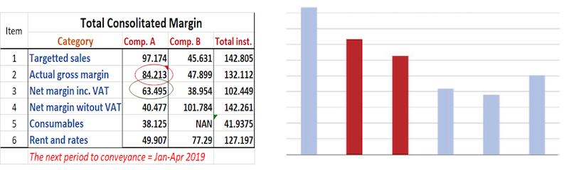
Graphs are extremely powerful, as they take numbers and turn them into shapes that our sophisticated visual system can feast on. A table of numbers is patternless because the only way to spot a trend is to memorize numbers and the differences between numbers as you read down columns and across rows. This takes overwhelming cognitive effort. A graph, however, turns these numbers into images that jump out at you, as the figure below shows.
This lesson presents three tips on how to get the best from your graphs.
Go Slow
Presenters mistakenly assume that if the audience is technically competent, they will understand any graph you show them. They won’t. Even with a simple graph, there are many things that need to be explained before that graph can make sense: title, units, max and min scale values, important features—slope, peak, trend, shape—trendline fitting, etc. You need to walk the audience through these assumptions slowly.
In this regard, PowerPoint can really help. Consider the set of plots below, which could be introduced on consecutive PowerPoint slides.
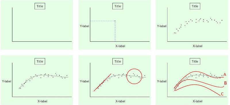
The first (top left) would explain what the graph aims to show. Then (top middle), you might explain what is on each axis, including clarification of scale and zero-offsets. On the same slide, you could explain what each individual point means, and show one. Following this (top right), you could show the full set of data points, followed by the trendline you fitted to them (bottom left) and why. Then, you might add visual highlighters (bottom middle) to draw attention to particular features of the graph. Finally (bottom right), you might overlay the graph with other comparison data-sets to put the results into context.
Use Gestalt Visual Associations to Make the Graph Clear
Often, people draw their graphs in Excel and let Excel make all the decisions on how the graph looks: color of plot lines, spacings, scales, zero offsets, etc. However, in accordance with the laws of visual perception we looked at in Lesson 5, you need to be in control of the visual elements of the graph so they guide the viewer to the relevant conclusions.
The below graph is an example of these principles at work.
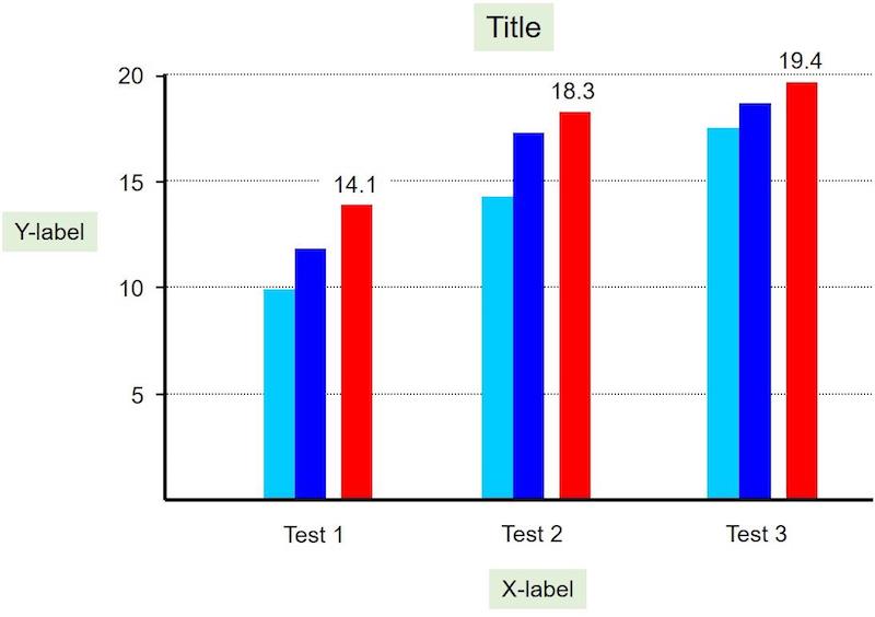
Without getting bogged down in what the graph is about, you can see the rules of visual association at work. Spacings (large and small), direct labeling of bars, and colors, as well as shades of color, make this graph much easier to interpret than if I had simply auto-plotted the nine numbers in Excel.
Think beyond the Obvious
The majority of graphs in presentations and reports are of just three types: bar, pie, and column. This might seem logical, as people are more likely to understand the few formats they are used to. However, even simple graphs can bamboozle an audience, so resorting to a few standard forms actually leads to complacency more than clarity.
I remember a presentation given by a group of statisticians who were explaining a concept called, “K-Means Clustering,” and wanted to present a real-world example. To do this, they visited a local liquor shop and noted the alcohol percentage (ABV) of various beers and plotted these against the price-per-liter of each one, as shown in the graph below.
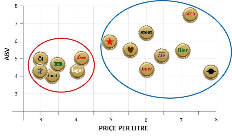
As you can see, instead of the data-points being just dots, they drew bottle caps with logos (real logos not shown above) because these would be familiar to the audience. Then, they ran their algorithm and produced and explained the clusters formed. I understood it perfectly and was amazed that I could grasp an advanced statistics concept in just a few minutes; the creative graphic really helped.
In a presentation, you can do anything you want with numbers and graphs. Anything. If it makes the concept clear, do it. If the audience looks what you put on the screen and goes, “Ah, I get that,” then you have succeeded. Don’t just crunch the numbers through Excel and take whatever auto-formatted graph it spits out. Think about what the audience will see, and design your graphs with this in mind.
Tomorrow, we will look at the main pitfalls that make graphs fail.
Recommended book
Share with friends