
Gestalt Associations: Visual Inference and Signposting
Episode #5 of the course Presentations: Making slides that work by Barry Brophy
In this lesson, we will look at the rules that govern how our visual system processes the millions of pixels of light that bombard our eyes every waking second. These are the Gestalt rules of association, and it is important to understand them when creating visual aids.
This sounds complicated, but the practical implementation of these ideas is quite simple. To explain this, three of the rules are shown in the figure below.
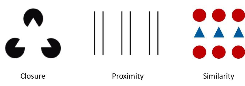
The principle of “closure” (left) states that if the mind can form a coherent shape, it will. Most people don’t see three circles (with wedges cut out), but rather one triangle. The principle of “proximity” (center) states that the mind will consider things that are close together to be grouped. Most people see this image not as six parallel lines, but as three pairs of lines (or as columns, roads, or whatever). The principle of “similarity” (right) states that the mind considers things that are similar—in shape or color, for example—to be grouped. So, we see this image as three rows, not three columns, because the items are similar in both color and shape along the rows.
Putting These Ideas to Work
Putting this into practice is simple. In fact, I have used these principles in formatting the figure above. For instance, I put a larger distance between the three examples than I did between the features within each example so you would see them as three distinct cases. Also, I put the labels, “Closure,” “Proximity,” and “Similarity,” close to relevant examples so they would be associated with them.
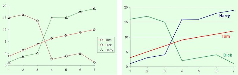
Often, people are careless with such visual associations. For example, they use legends when they could make things clearer by labeling plot lines directly—proximity—and in the same color as the plot line—similarity—which is shown in the figure below.
In your visual aids, you should use intuitive color associations, such as green for advantages and red for disadvantages, and represent larger quantities or items of greater importance with, say, larger fonts.
But above all else, be consistent. If you have a list of advantages on the left and disadvantages on the right in an overview slide, and then you wish to go through the items one by one, put each advantage on the left and each disadvantage on the right. If you have the presentation running along a problem-solution structure at the start, don’t switch to a timeline structure later. This way, your visual aids will guide the viewer smoothly through your presentation like signs on a motorway.
Examples from Real-Life Presentations
Below are two slides that use these visual rules of association very well. They come from a presentation on Compressed Air Energy Storage, or CAES. CAES is a technology for storing excess electricity produced by wind and solar power. The spare energy is used to compress air and pump it into underground salt caverns. Later, you retrieve the energy by passing the compressed air through a turbine that powers a generator.
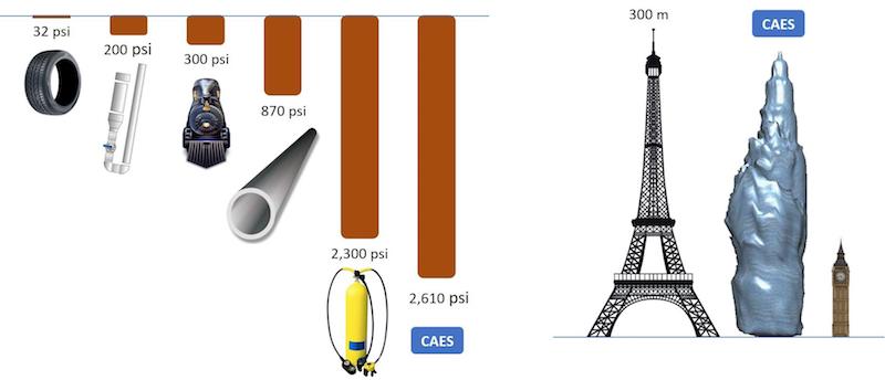
The slide on the left was used to show the pressure in the underground salt caverns and speaks for itself. The length of each bar is proportional to the pressure and each picture represents a real-world example of that pressure. It should also be noted that these elements were introduced one by one.
The slide on the right was used to give an idea of the size of a typical salt cavern. The geological image of an actual cavern is flanked by two familiar visual analogies, the Eiffel Tower and Big Ben. If the presentation were being made in the US, the speaker might use the Empire State Building or the Statue of Liberty. The point is, you could say these numbers, write them down in bullet points, put them in a table, or even plot them on a standard graph, but the use of images with visual association prompting makes them much clearer and more intuitive.
Tomorrow, we will look at another type of visual aid, where there is animation, emotion, sound, color, and a storyline, all together. It is one of the most underutilized presentation tools and often requires almost no preparation time at all. The name of this magic visual aid: video.
Recommended video
Gestalt Principles | Khan Academy
Recommended book
Human Factors for Technical Communicators by Marlana Coe
Share with friends