Circle Meets Line
Episode #4 of the course How to analyze signatures by Annette Poizner
“Be aware of wonder. Live a balanced life—learn some and think some and draw and paint and sing and dance and play and work every day some.” —Robert Fulghum, American author
If you think of it, the dance of handwriting is nothing more than a choreography that brings together circles and lines. Those two bedfellows—the circle and the line—are the building blocks of letters, numbers, doodles, drawings, and even logos.
Check this out:

Logo of Federal Express
You’ve seen the FedEx logo. Perhaps you are aware that there is imagery embedded in that logo. See it? Don’t read on until you look again.
Embedded in the white space between the E and the x is an arrow pointing to the right. There is the straight line, the arrow, bringing its message: This company thrusts forward, moving your package to its destination with the speed and precision of an arrow. Behind this obvious symbol is another more subtle. Look dead smack in the middle of the logo. See it?
Right! The dead center of the logo is a circle, located right within the center of the d. It shows how comfortable you can be, at home, in your nest—centered—while this company thrusts your package to its destination out there.
My point here is to show you that a successful logo will often have an expression of both the Yin and the Yang, the masculine and the feminine principle. Similarly, the balanced healthy writer ideally showcases both rounded strokes and angles in the handwriting. The angles indicate analytical thought. The rounded strokes show access to emotion and reflect an interest in connecting with others.
Too Many Angles?
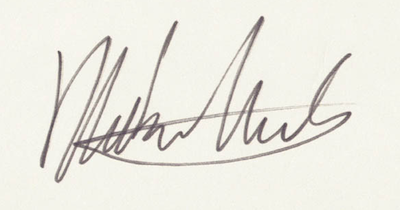
Some writers have a handwriting that is quite angular. Without adequate loops, the handwriting is illegible, showing less concern for others. After all, if you are writing, don’t you have an obligation to do so in a way that others can read? Extreme angularity shows somebody’s personality is focused on execution, less mindful of bedside manner. Also, excessive angles betray the writer who is constantly stressed out and tends to be irritable.

Signature of Mike Nichols, film director
Too Rounded?
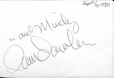
Conversely, too much roundedness in handwriting lacks the stabilizing definition that straight lines provide, revealing someone overly emotional. Looking back, that could be said about Pam Dawber’s script. Note that the degree of roundedness makes the handwriting look like that of a child. The graphologist would assume this writer to be extremely sensitive, which would give her an experience of herself as “emotionally young.”

Pam Dawber’s signature
We also see the prevalence of rounded strokes in the signature of the late Elizabeth Taylor, a movie star. In tandem with a degree of irregularity in the handwriting, the base line is wavy (unstable, she is on a roller coaster!), and the letter size varies from large to tiny. We are not surprised to learn that she had problems regulating emotion. Speaking of herself, she said, “I have the emotions of a child.”

Signature of Elizabeth Taylor
Just Right!
Let’s look at a few examples of balance as we find it in handwriting and in personality.

Signature of Dr. David Ho, AIDS researcher
The signature of Dr. David Ho shows that this writer employs both angles and rounded strokes. Balance. Good bedside manner, good analytical skills. The handwriting is legible, indicating a good communicator.
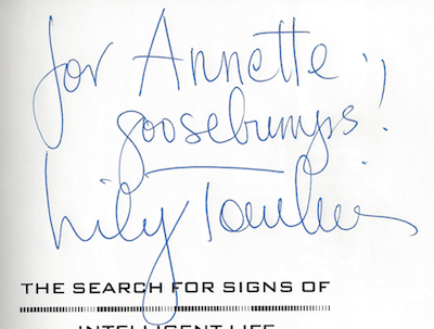
In her signature, comic Lily Tomlin uses angles and rounded strokes. This is someone who is warm and kind, functional and competent, analytical and creative.

Signature of Lily Tomlin
Today, we learned how balance in the handwriting implies a degree of flexibility that promotes success and health. Tomorrow, we will look at another personality that peppers the landscape: the copybook writer, also known as the traditionalist. We will see how we can spot the writer who reveres time-honored traditions on the basis of handwriting.
Recommended reading
Learning More about Balance from Barbra Streisand
Share with friends

