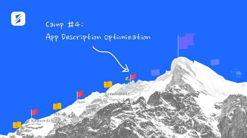
Camp #4: App Description Optimization
Episode #6 of the course App Store Optimization (ASO) fundamentals by SplitMetrics Academy
Welcome to Camp #4! There are two easy sections before reaching the ASO Summit: description and video preview and rating optimization.
First, let’s talk about the description.
Potential app users see just 252 symbols, and less than 2% of them actually open the full description. Therefore, the most important information—and what will be read—should appear above the “. . . more” link.
A short description should be scannable and easy to read. Therefore, you will want to use one- to seven-word sentences, a clear structure, and strong call-to-actions. Here are several super effective triggers you can use:
• Power
• Greed
• Competition
• Acceptance
• Status
• Fear
• Identity

What other elements can catch users’ attention?
Other ways to make a description resonate with your audience and be fun and engaging are:
• Social proof. If you already have one, try to highlight it. Explain what it actually means: “5 million people play the game—that makes us #1 in the genre.”
• Strong emotions. Emotions like anger can potentially drive more downloads than positive emotions.
• New features. If you have just updated your app with a new hot functionality, try mentioning it to show that the app is supported and gets regular updates.
• Reviews. Have influencing media resources reviewed your app? Consider adding a review to the description.
• Localization. You need to make sure you’ve really localized them, not just translated. Ask a native speaker to review your messaging and change the brand’s tone if needed.
Five big description don’ts
You don’t want to force potential users to read a long piece of text to only get an idea of what an app is about—you should use screenshots for this aim. In the description, you’ll want to share what your app does, what problem it is solving, in what order, and how. Shorter is better.
You don’t want to waste any space in the fold description because of blank lines and interrupted sentences. Revise it, and make sure the most vital ideas you address to your users are not cut off. Remember that on mobile, you have only 252 characters visible before the “. . . more” link.
That said, the blank lines are a great help when it comes to a body. Unlike plain text, a clear structure makes a description easy to skim:
• Separate blocks with lines and headers.
• Keep paragraphs short, three sentences maximum.
• Construct a feature list with bullets.
It almost goes without saying, but app developers should never promote features that the app doesn’t have yet. If a user downloads an app with a set of expectations and the app doesn’t deliver on that, you get an unhappy user. For the same reason, the double-meaning should be avoided.

Quick task: Review your app description. Look through the recommendations one more time, and write the first 250 characters of the description for your app.
In the next letter, we make the last preparations before climbing to the Summit: testing page elements and analyzing them. We will talk about video previews and the importance of ratings.
Recommended book
How to Write Short: Word Craft for Fast Times by Roy Peter Clark
Share with friends