
The Dangers of Information Overwhelm (and How to Combat It)
Episode #5 of the course Psychological factors that influence purchase decisions by James Scherer
Remember high school or college? Sitting there in the library trying to study for an exam, but the words on the page just kept blurring? The massive block text became overwhelming and you felt a headache coming on?
This is information overwhelm, and in a world where we’re constantly exposed to information and stimuli, it’s a serious issue.
Information overwhelm is more formally defined as the concept that people have a limit to the amount of information they can absorb. If you throw too many stimuli at them, their mind will start ignoring things.
In the context of your website, information overwhelm is caused when you try to give your traffic all the information at the same time, thinking that the best way to sell your product or service is to show people every possible reason they should buy.
It results in a drop in conversion rate, high bounce rates, and a resistance to the return visit. People want simplicity. They’re lazy (remember Lesson #2 about urgency?).
The more you make people work, the less likely they’ll be to engage, convert, and buy.
The way we combat information overwhelm is with Progressive Disclosure.
Progressive Disclosure is a strategy that enables your website visitor to control their exposure to information on your website. Researchers at IBM in the mid-1980s determined that “hiding advanced functionality early on led to an increased success of its use later on. The approach [was also] dubbed ‘training wheels.’”
Progressive disclosure is also an appealing design strategy, as it enables you to create a cleaner, simpler, less intimidating look while retaining the information people need to know.
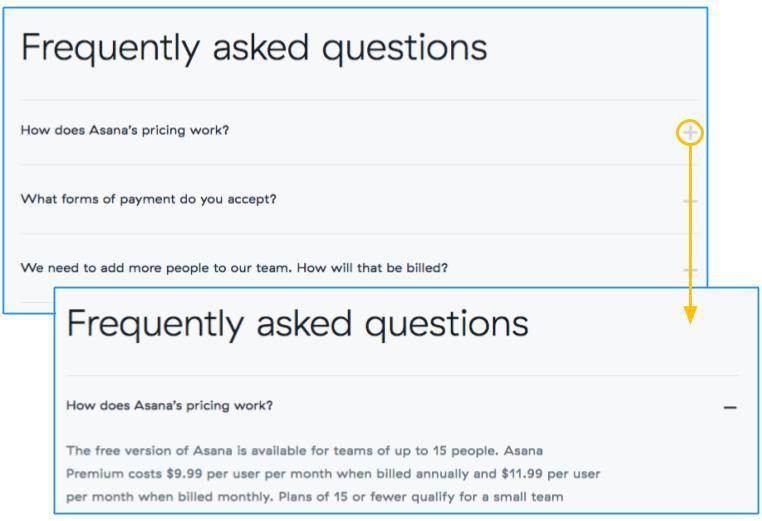
Here’s an example of progressive disclosure from project management Asana’s pricing page:
There are a few strategies to combat information overwhelm with progressive disclosure:
• a simple “Learn more” link, which sends people to a page (or pop-up) with more detail
• an accordion or expanding control with further options or features
• a “plus” or “minus” button (or “show more” equivalent link) that shows or hides additional information (for instance, Twitter’s “View Summary” or Facebook’s “See all Comments”)
• triangles or chevrons indicating the direction in which content would expand, offering more detail
There are also ways to combat it with simple formatting:
• breaking up the paragraphs (try bullet points)
• emphasizing parts of text with bolding, italicizing, underlining, and text of different sizes, stimulating the eye and preventing boredom
• using encapsulation to draw attention and separate the concepts you want to communicate; people can handle more information if they can see its limits
Actionable takeaway for this psychological factor:
When creating your website copy, first write down everything you can think of that prospective customers might want to know. Then highlight the most important elements and go back over it. If something isn’t necessary at all, remove it. If something isn’t vital to the purchase decision, hide it within an expandable box or on another page (behind a “learn more” link).
Tomorrow’s lesson will cover the concept of “newness” and strategies you can use to add it to your products and service. Newness is one of the most powerful psychological effects that influence the value we place on something, separate from its actual value.
Ever bought a new smartphone only to be slightly confused as to what changed?
I’ll get into it tomorrow!
Recommended book
Share with friends