
How to Design your Site for Conversion
Episode #4 of the course Psychological factors that influence purchase decisions by James Scherer
Today’s lesson is all about design—those simple elements of a website that direct focus toward a selling point, a call-to-action, or a benefit that people wouldn’t otherwise see.
Controlling that attention enables you to design with a hierarchy in mind and in practice. What do you want people to see the most? What factors of your sales pitch do you want to be front and center?
There are four primary design elements you can use to effectively make your website more focused on conversion:
1. continuation
2. eye direction
3. contrast
4. encapsulation
Let’s get into it!
Continuation
Continuation is the phenomenon in which the human eye follows straight lines to their origin or destination.
We see it in art all the time. Here’s an example from Monet:
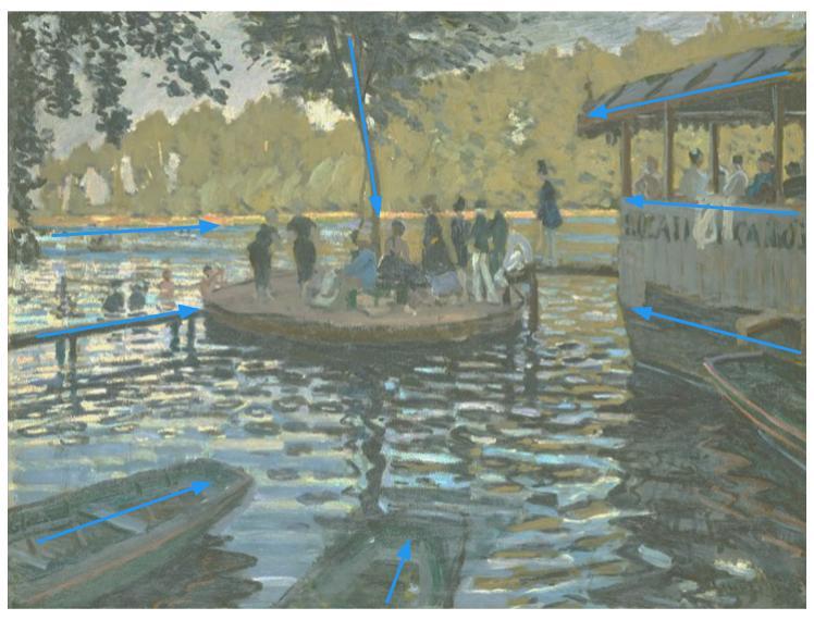
Artists and website optimizers can use continuation to direct the eye. Consider linear cues and arrows when designing your pages.
Eye Direction
Eye direction taps into a similar phenomenon as continuation—the fact that our gaze naturally follows a person’s eyeline toward whatever they’re looking at.
Here’s an example of an A/B test (with eye-tracking overlaid) from a diaper company, showing a baby facing forward:
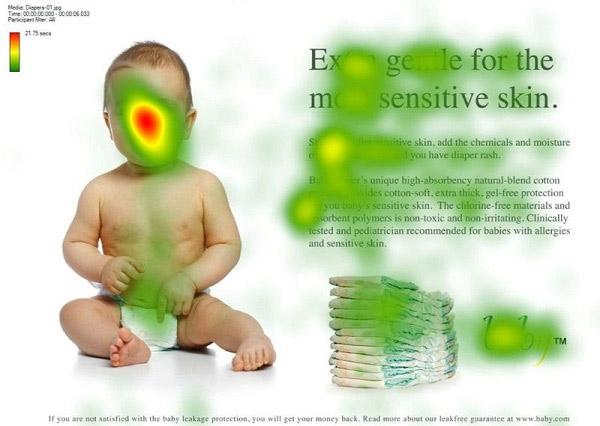
See how the focus of the eye-tracking is on the baby’s face, rather than the headline or product?
And here, one with the same baby facing the copy on the right side (where your selling points and call-to-action would be):
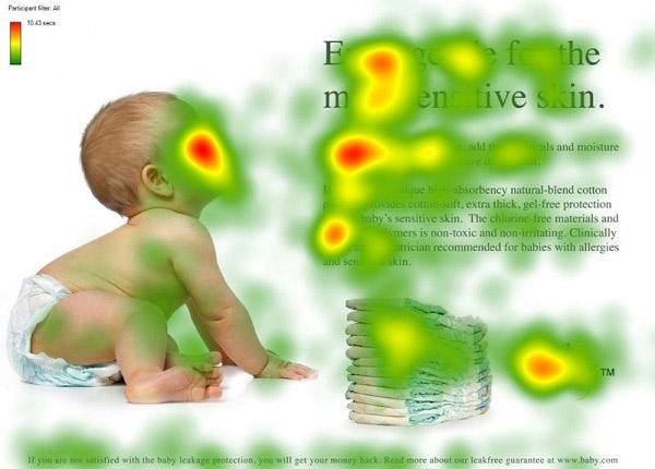
That’s much better.
Contrast
Perhaps the most impactful design element is contrast—an element able to make something stand out in a powerful way.
Color contrast is perhaps the most common, but size and shape can be just as crucial.
When creating color contrast on your website (to attract the eye to your call-to-action buttons, headline, images, benefit list, or simply to make your page look visually appealing), consider the color wheel, and choose colors across from each other:

Here’s an example from a recent landing page we created. Notice that the accent color (orange) effectively draws the eye to the call to action:
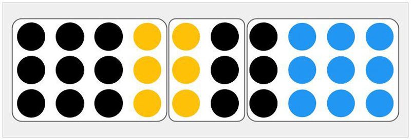
Encapsulation
Below is the best example of encapsulation I’ve found. The human eye delineates categories far more effectively with borders than it does with actual similarity. Given the color and contrast, you might think that there are four groups of circles here. But because of encapsulation, we only see three:
Actionable takeaways for these psychological factors:
• Have a model on your landing pages, homepage, and advertisements “looking” at your desired focus point—no matter if that’s your chief selling point, your CTA button, your form, or a picture of your product.
• Just as you’ve included a model looking at your page’s primary objective or selling point, also add lines (even half lines) that aim in the direction of your focus point. Important: Avoid using blatant arrows, as people respond negatively to obvious attempts to get their attention—a subconscious nudge is just as effective (if not moreso).
• Add white space or borders to your landing page forms to delineate them from the rest of the page.
Tomorrow’s lesson will show you how to combat the dangers of “information overwhelm”—a common problem with businesses trying to give their prospective customers all the information they can possibly need to make a purchase decision.
Recommended book
Share with friends