How Color Affects Emotional States (and Why It Matters to Your Sales Funnel)
Episode #7 of the course Psychological factors that influence purchase decisions by James Scherer
Satyendra Singh of the University of Winnipeg conducted a study in 2006 that looked at color in marketing. She found the following:
“Prudent use of colors can contribute not only to differentiating products from competitors, but also to influencing moods and feelings – positively or negatively – and therefore, to attitude towards certain products. Given that our moods and feelings are unstable and that colors play roles in forming attitude, it is important that managers understand the importance of colors in marketing.”
Let’s break down the primary colors you might use and how they can affect buyer intention.
Red
Red is associated with passion, urgency, and excitement. It attracts the eye and causes your heart to beat faster.
Positively associated with passion, it’s also the color your teacher would use to mark your papers, so don’t use a red line to draw attention to your call-to-action or primary feature (people will immediately assume that it’s negative attention).

Also, it is a very (stereotypically) “male” color. The example above (from SportsBetting.ca) is just one of many male-oriented services that use red within their brand colors.
Actionable takeaway for this psychological factor:
Be extra-cautious with red. There’s almost never a time when red would work better than orange.
Yellow and Orange
The most eye-catching colors, yellow and orange are associated with light, happiness, and friendliness. However, they both should be used only with a calmer, darker color (as an accent). Otherwise, you’ll overstimulate your visitor’s eye. Orange and yellow also look great against a blue primary color (which is the most common primary color online).
Actionable takeaway for this psychological factor:
Yellow and orange are excellent attention-getters. Use them in your CTAs and as borders around your display ads.
Green
The easiest color for the eye to process, green is typically related to wealth and the environment. It means “go,” and as a result, it’s a great color to use for affirmation, confirmation, or accepted payment. It’s also a good color for your website or landing page’s CTAs, as it works well with the standard dark blue or black.
Actionable takeaway for this psychological factor:
Review confirmation signs on your website and CTAs on your landing page. Would they look better in green?
Blue
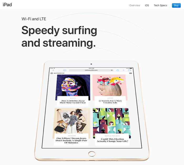
Blue is the most frequently used color online, and that makes sense because it’s most people’s favorite color (for both genders). Thus, blue is a very versatile color, used by Facebook, IBM, Salesforce, and the majority of other businesses online. It’s professional, clean, and corresponds well with high-visibility accent colors like orange and yellow.
Blue is associated with clean, peaceful qualities. Dark blue is associated with professionalism (think dark blue suit), while light blue is associated with calm and youth.
Actionable takeaway for this psychological factor:
Try blue as a primary color for your website. But be cautious—don’t use blue as your primary color on the Facebook platform because your post or ad images will blend in with the platform’s color scheme.
Black
Black is all about sophistication, permanence, and sincerity. Though it can be a bit of a dangerous color if used too much, like dark blue, it’s great to communicate professionalism. But if your target market is young or “fun,” avoid black.
Also, black makes for a very clean website if used in conjunction with a calm accent color, like green or blue.
Surprisingly, most designers don’t use a straight black for their font color, but rather a dark grey. Dark grey is easier on the eye when put on a colorful background.
Actionable takeaway for this psychological factor:
If your color scheme is clean and contains lots of white or solid, clear color, consider adding some black to it. But be cautious—don’t use black if you’re also using greys or tans.
White
One of the most popular colors for modern graphic designers, white is all minimalism, simplicity, and modernity. White works really well as your encapsulation color.
Actionable takeaway for this psychological factor:
If you have a colorful product (or software), surround it with white. When in doubt, add whitespace.
Important note: Be sure that you’re not using more than two or three colors across your website.
Now that we’ve covered color psychology, tomorrow, we’ll dive into how images affect buying behavior.
Recommended book
The Non-designer’s Design Book by Robin Williams
Share with friends